The Website That Almost Was
Snarkly, the website that almost was.
I was asked to do preliminary design work to create a competitor to Etsy.com.
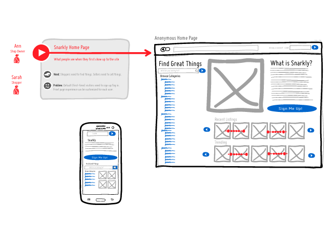
The home page. Two personas were developed: Ann, a shop owner, and Sarah, a customer. Desktop, touchscreen, and mobile layouts are shown. Picture navigation by swiping in either direction or using the navigational arrow buttons on either side of the row.
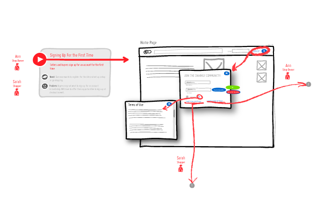
Signing up for the first time. Initial user name/password in a pop-up screen, with terms of use copy in another pop up. The user chooses whether they want a shopper account or a vendor account, which takes the user into different paths. The shopper can start shopping, and the vendor will have to fill out an application form.
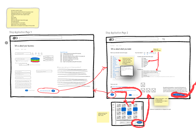
The application form is 2 pages: The first page, Tell us about your business, collects contact information and filing status about the business, and contains the terms under which a vendor can sell on the site. The second page, Tell us what you make, collects information about what the vendor makes and their process. There is a pop-up to upload photographs of products and process. The image upload pop-up is a standard pattern on the site.
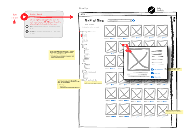
Product search/browse page includes a search bar and a hierarchical taxonomy selection list (categories, color, size, price, vendor name, etc). These update the thumbnails in real time. Selecting a thumbnail shows a popup window with larger photo, more product information and links to put in the shopping cart, add to a wish list, or go to the vendor’s store to view more information and items.
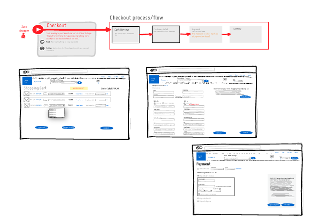
Checkout process, including cart review, shipping/billing (and opportunity to create account if they don’t have one), and payment pages. Not shown is a confirmation/summary page at the end.
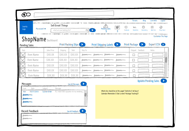
Shop dashboard for a vendor, showing latest sales that require shipping, messages, and recent feedback.
Results: The project did not obtain funding for further development and was dropped.


